In the past few days, I have received several newsletters that are riddled with basic errors. A newsletter sent with inappropriate content and style is as if you didn't send it at all, it doesn't fulfill any marketing purpose.
If the size and unsolicited nature of your newsletter even bothers the recipient, then the name of the company will be associated with an unpleasant experience that is clearly disadvantageous. If you do not even comply with the basic rules for sending newsletters and data management, you can expect a heavy fine.
In order to send an effective and successful newsletter, I recommend that you review the following rules:
Tartalomjegyzék
- 1. The subject of the newsletter is the most important
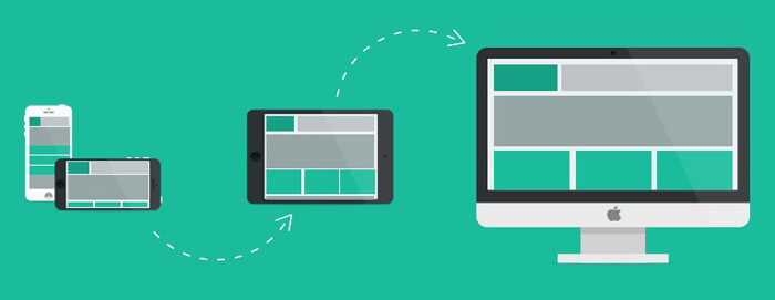
- 2. Make your newsletter responsive
- 3. Use a maximum of two fonts
- 4. The size of the newsletter should be as small as possible
- 5. Use impersonation
- 6. Use elements with a maximum width of 600 pixels
- 7. Place your logo in the upper left corner
- 8. The appearance of the letter should always be consistent with your website
- 9. Make your content relevant, relevant and engaging
- 10. Important information should be placed above the fold
- 11. Refer to your website in the newsletter
- 12. Make your newsletter printer friendly
- 13. Initiate a dialogue
- 14. Ensure GDPR compliance
- 15. Make unsubscribing easy
- 16. Use as few images as possible
- 17. Users can write to the reply address
- 18. Don't buy an address list
- 19. Maintain your address list
- 20. Don't send spam
- 21. Have a strategy
- 22. Find the best day to send
- 23. Find the best time to send
- 24. Quantity vs. quality
- 25. Try the "5 second" test
- 25+1. Test before sending
- Summary
1. The subject of the newsletter is the most important
The subject of the newsletter should not be empty, it should be talkative and attention-grabbing. Curiosity and interest must be aroused in the reader so that he cannot resist the article! In the case of an online newsletter, it is advisable to start attracting this attention already with the subject of the e-mail.
If the subject field itself is uninteresting, then even if you wrote the best newsletter of the decade, no one will read it. At first, only the subject field (and possibly the first 1-2 sentences) of your newsletter is visible, so it is important that the subject "sells" the newsletter.
The most effective items are between 30 and 50 characters long, including spaces. The reason for this is that mobile devices - due to the limited available space - in many cases simply cut off and do not display the parts above this. Therefore, the first 50 characters must be attention-grabbing and must also contain why the recipient should open your letter, why it is worth reading it.
Do not always send the same subject field ("XY company newsletter 07", "XY company newsletter 08", etc.).
Writing a good subject line is just as difficult as giving an article a good title. But we can give you a few tips:
- be relevant to your reader
- if the offer is time sensitive, mention it
- build on his curiosity
- communicate that you get value by reading the newsletter
If there is an incentive text in the subject of the newsletter, you can even increase the opening rate by one and a half times.
Examples of incentives
- Free delivery
- 20% discount
- Gift in case of additional order
However, you shouldn't overdo it either. Always think about the most effective incentives related to your activity and always be in line with your target group.
2. Make your newsletter responsive
More people read email from mobile devices than from a PC. And if your e-mail is poorly displayed on mobile, 75% of your subscribers will delete your newsletter.
Even the design of your newsletters should be responsive.

3. Use a maximum of two fonts
The readability of letters is related to the conversion rate. Fewer distractions, such as using variable fonts, will help increase conversions.
4. The size of the newsletter should be as small as possible
Do not attach large photos or pdf attachments to the newsletter, think about those who check their e-mails using a slower mobile internet connection. If you definitely want to display images and downloadable documents, redirect the visitor to your website from the newsletter and do it there.
5. Use impersonation
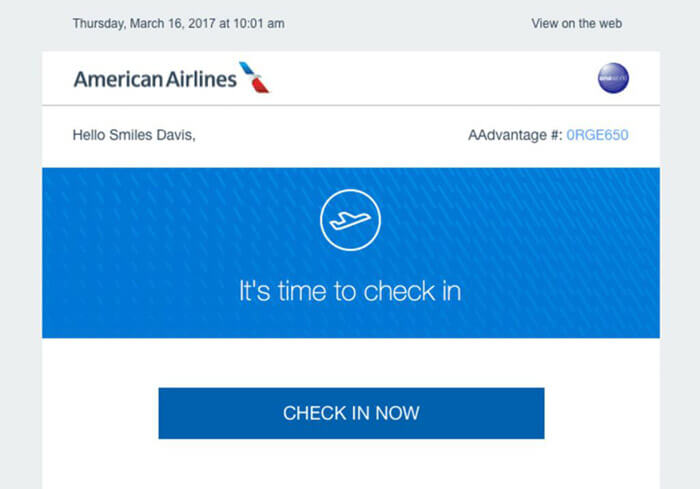
Nowadays, users pay less and less attention to messages that start like this: "Dear User!". Messages beginning with this or similar address are clearly identified as newsletters. By personalizing your address, you can capture the attention of your readers by making your message personal.
Almost all newsletter management systems are able to automatically insert the right name for the address from the available list. In other words, you don't have to write a separate letter to everyone, just write one perfectly and your users will receive your letter with a personalized address.
6. Use elements with a maximum width of 600 pixels
More than half of Internet users now browse from a mobile device. If your letter contains elements wider than 600 pixels, primarily images or videos, then your message must be read horizontally for proper display. The majority won't turn their device around, so they won't read your message either.
The pixel width of messages is one of the most important conversion factors.
7. Place your logo in the upper left corner
According to the results of eye tracking research, most users instinctively look at the upper left corner of the email first, because this is where they are looking for the recipient. In other words, the best way to be instantly recognizable to your customers is to place your logo in the upper left corner of your message!
8. The appearance of the letter should always be consistent with your website
The appearance of your letters must be consistent with your website. The user who opened your letter, read it and then clicked on the link in it did all this because you aroused his interest. However, if the style and content of your website do not match your newsletter, the user will almost certainly leave your site immediately.
The harmony of the different interfaces is a very important aspect in the long-term engagement of customers and gaining their trust.
9. Make your content relevant, relevant and engaging
If you struggle to get to the point, they won't read your newsletters. The plural is intentional: if you send 3-4 boring newsletters, your subscribers will get used to the fact that it's not worth opening.
The most important part of your newsletter is not the design or the time it is sent out, but the text (excellent text can stand without design, but even the best newsletter design does not save bad text).
The first sentence should make it immediately clear why you are writing and why your subscriber should read it. Most of your subscribers receive dozens of emails, so don't waste time with a long-winded newsletter.
10. Important information should be placed above the fold
The majority of users only read the information above the fold and only scroll further if it piques their interest. This means that you must place the first call-to-action (CTA) before the fold.

11. Refer to your website in the newsletter
Visitors prefer to read longer articles and studies on the website, where it is also possible to recommend additional articles, products, and services. Therefore, in your newsletter, give the reader the opportunity to easily reach your website by clicking on a link.
12. Make your newsletter printer friendly
Give the reader the opportunity to print and read your letter later if necessary.
13. Initiate a dialogue
You can also use interactivity when choosing a topic for your newsletter. Ask him what he thinks, what he's interested in, what he wants! This makes customers feel important and will pay special attention to you!
14. Ensure GDPR compliance
Based on the current data protection law, the name and e-mail address used to send the newsletter are considered personal data, therefore the GDRP guidelines must be followed for their storage and handling.
15. Make unsubscribing easy
The recipient of the letter must be provided with the option to unsubscribe immediately in the newsletter. If the recipient does not require the newsletters, the option to unsubscribe can prevent possible complaints.
You will have unsubscribers and that's totally fine. On the one hand, your list is "clean" (those who unsubscribe won't buy from you anyway), and on the other hand, it's cheaper to send out (many newsletter sending services bill per piece).
However, if you make it difficult to unsubscribe, you can only lose.
The ideal unsubscribe takes just one click and the link is easy to find at the bottom of the email. If someone doesn't find it (because you hid it), they mark it as spam. If you have to have fun with unsubscribing (write an e-mail), you mark it as spam. If he still receives emails from you after unsubscribing (so you didn't take him off your list even though he asked for it in vain), he marks it as spam.
And if many people mark your newsletter as spam, you won't reach your existing subscribers either, because the mailer will filter you out.
16. Use as few images as possible
Many e-mail programs do not display images by default if the mail comes from a foreign address - in this case you have to click to enable it.
And not everyone will click. If your newsletter consists only of images, some of your readers will not be able to read it.
- To begin with, the most important elements (headlines, call to action, links) should be text.
- Then, when sending out, also set the plain text version (this is displayed if someone does not request HTML letters).
- Ask your subscribers to add your sending address to their address list (in Gmail, this also means that images from you will be displayed in the e-mail).
- And before sending out, see how your newsletter looks without displayed images.
17. Users can write to the reply address
Avoid using "no-reply" type sender names in your newsletters, because it breeds mistrust.
Create a separate email address used as the sender of our newsletters, so users can send their questions to you. In addition, recipients are much more willing to open a newsletter, thereby increasing the opening rate of our letters, if they were received from a real or seemingly real address.
18. Don't buy an address list
This seems obvious, but it bears repeating. Mainly due to the General Data Protection Regulation (GDPR), which entered into force on May 25, 2018, as it requires consent from all European Union addressees to receive emails from you. In the case of purchased lists, it is not at all certain that users have given permission for this.
We wrote about the General Data Protection Regulation (GDPR) in detail in a previous article, it doesn't hurt to bring it up again.
The effectiveness of newsletters primarily depends on the opening rate. If you send your letters to recipients with whom you have not previously contacted, that is, they do not expect a letter from us, the effectiveness of your campaigns will quickly decrease.
19. Maintain your address list
Many users do not unsubscribe from your mailing list, but they never open your newsletters. At first, it may seem like a good idea to send your emails to as many recipients as possible, but those who never open your emails reduce your open rate and hurt your statistics.
Depending on the frequency of sending your newsletters, it is worth analyzing monthly or quarterly, who are those who never open your emails and remove them from your address list. In this way, you will receive more accurate statistics about your active customers and you can optimize your campaigns more effectively.
20. Don't send spam
Do not send unsolicited advertising letters to your customers, because according to Hungarian legislation, newsletters can only be sent to those who have signed up for the service.
Having the person's e-mail address is not enough reason to send a newsletter. Maybe you know his e-mail because of a previous purchase, or maybe you bought from a database - all of this is irrelevant.
You can only send him newsletters if he has expressly consented to this - that is, he has subscribed to a newsletter and confirmed his subscription.
21. Have a strategy
Many people send newsletters when they realize that nothing has been published for 2 months. Such a newsletter is contrived and less effective (your subscribers are not used to receiving regular e-mails either).
Take your time and think not in individual newsletters, but in continuous relationship building (so see the big picture).
- How does the newsletter fit into your sales cycle?
- Who reads it? What are they waiting for? What did they sign up for?
- Which newsletters have been successful so far?
- What is your goal with your newsletters?
- How will you aim? What segments do you send a newsletter to, what will it be about and when will you send it out?
It will be easier to prepare the newsletter itself later if you answer these questions before starting work.

22. Find the best day to send
Monday is definitely not good. Think about it, at the beginning of the week you go to work, your e-mail account is flooded with letters from the weekend. In such cases, we automatically delete unimportant messages so that tasks can be quickly cleared. Newsletters will most likely end up in the trash as well. This may also be one of the reasons why no one recommends the Monday timing.
Weekend? Weekend timing can also be a problem, numerous analyzes show that weekend letter openings are far below the weekly average, as people tend to relax on the weekend rather than read newsletters.
"Favorite days", if you can write it that way, are Tuesday and Thursday among the other days of the week. Many marketing blogs indicate, and MailChimp agrees, that these two days bring the highest rate of mail opens. According to some suggestions, Wednesday is also considered a suitable day in addition to Tuesday and Thursday.
23. Find the best time to send
Many people have the question of whether to schedule the sending of the newsletter for day or night. The majority of experts vote in favor of sending during the day, but if we really go into the investigation, we will find research that suggests that the first thing most people do when they get up in the morning is to browse their phones, and in this case, the first thing they see is the newsletter that was sent out at night.

24. Quantity vs. quality
Rather, send information less often, but useful for the reader. Recipients will respond to useless information sent too often by unsubscribing.
25. Try the "5 second" test
An old and proven trick is to send your letter first to a person you know and trust, or more effectively to several recipients. Ask them: "Can you tell me immediately what kind of reaction I expect from the letter?". If their answer is in line with your goal, then the call to action (CTA) in your message works well, you have edited the message correctly. However, if not, it is more than likely that your other recipients will react similarly.
25+1. Test before sending
You cannot withdraw the sending once you have sent it. Therefore, before sending it out, send it to all your colleagues - if possible, test all mailers and software to see if the design is perfect, if the links can be clicked and if the text is readable.
Summary
There are many online marketing tools available to promote your business and drive new visitors and customers to your website. Just think of the potential of Google Adwords and Facebook ads.
However, email marketing has stood the test of time and is still one of, if not the most effective marketing tool, especially if you can make it an integral part of your communication strategy.


