The hero image is an oversized banner at the top of the website. This is the image that the user encounters for the first time on the website, it catches their attention first, and because it is located at the top and usually fills the entire screen width.
The hero image is usually a high-resolution image that often contains the company's Unique Selling Point (USP) and call to action (CTA), such as a sign-up form or a button to start shopping. In addition to high-resolution static photos, videos and animations appear as hero images on more and more websites.
Tartalomjegyzék
Why should you use a hero image?
Most people are visual types, so using a well-chosen Hero image - be it a high-resolution static image or even a video - increases the chance that the first impression of the user visiting your website will be positive, and therefore the number of conversions on your page will increase. For this reason, it is perfectly suited to encourage visitors to take action and to present your business and its main features and advantages in a visual form.
What should you pay attention to when using the hero image?
Two important factors must be considered before you start using it.
In any case, the Hero image must be of high resolution, so use it only with due care and competence, as it can affect the loading speed of the website. According to a research by Google, if the loading speed of a website increases by 0.9 seconds, it can reduce its traffic by up to 20%. In other words, the Hero image - no matter how excellent it is - can lose its effectiveness if it takes too much time to load the website due to its use. Always use a properly optimized image or video.
The image used should actually add something extra to the website. Using stock photos is a quick and cheap solution, but it is not original at all and is often commonplace. Think about how many websites the same photo can appear on? Therefore, definitely avoid using stock photos as Hero images.
How to choose the right hero image?
Choosing the best image for your website is a difficult task. It largely depends on whether you are selling a product or service or want to use it to present your business. In addition, as I already mentioned, you can even use video. And I cannot stress enough that the Hero image must always be high-resolution and properly optimized!
It is very difficult to say in advance what kind of reaction the used image will elicit from the visitors of your site, so it does not hurt to try several variations and test them, and then decide which will be the final one. It is recommended to ask the help of a web designer to choose the right image.
Use an image that matches your activity
The images used on your page can improve or ruin your web design. Always use an image that expresses and aligns with your goals. Using a bad image will be immediately visible in the number of users leaving your website!
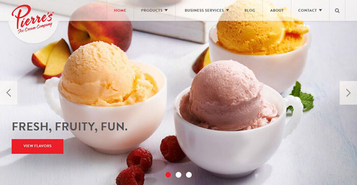
Use a high resolution image for the hero image
The Hero image should not be blurry or pixelated, as there is no bigger web design mistake than using large and low-quality images. A picture of perfect quality radiates confidence to users.

Have a call to action (CTA) on the hero image
The focus is on the image, but using a call-to-action button can't hurt either. A button placed on a nice image leads to increased conversion!
Have a call to action (CTA) on the hero image
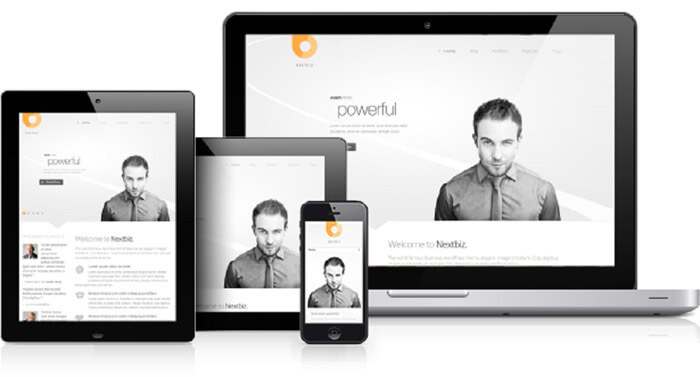
Today, there are as many devices with different resolutions as there are users. Make sure that the Hero image is optimized for the most common resolutions.
Case studies from around the world
In the following, I will show through examples which types of images are most effective for achieving different goals
Product sales support using hero image
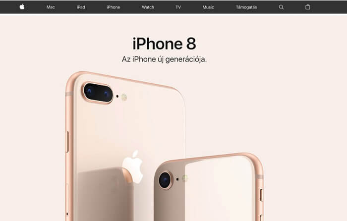
In many cases, a simple and clean high-resolution product photo is the best choice. In the case of several products, you can use a slider to present all of them. An excellent example of this is Apple's website, which grabs the attention of visitors with its images.
Highlighting available benefits with hero image
A Hero image that emphasizes the benefits available or the unique selling point (Unique Selling Point - USP) is the perfect choice for service-providing businesses. With a dynamic Hero image, UXPin's website immediately gives visitors the opportunity to use their service before they do anything on the website.

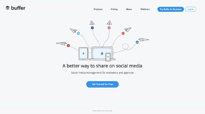
Simple illustration on hero image
With the help of a clean and simple illustration, you can inform your visitors about the activities of your business in a way that will not be burdensome for them at all. A perfect example of all this is the Buffer website.
Using hero image to build trust
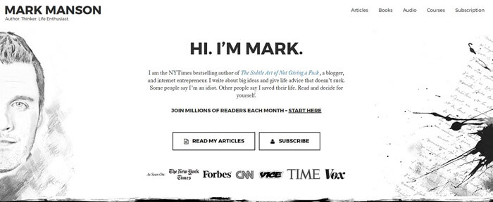
Everyone who runs a blog has faced the fact that it is increasingly difficult to attract the attention of readers to read the posts. A well-chosen image is always able to attract the attention of readers.
One of the best examples of this is Mark Ronson's blog. Since you add your face to the page, users see you as authentic and read your posts more than they would on a "faceless" blog.
The human factor
I'm not going to tell you a secret that you build the trust of your website visitors with unique pictures of real people. It is important that stock photos are not really suitable for this, and in most cases they have the opposite effect!
An excellent example of proper use is the Poco People website.

Hero image to evoke emotion
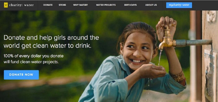
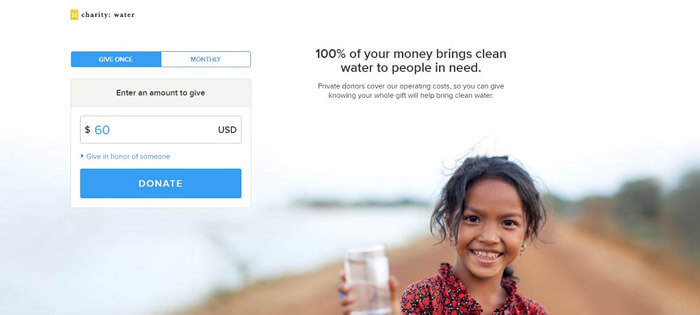
If you affect the emotions of the users, your message is more likely to reach its destination. Use this only if your website was created for a charitable purpose, for example.
A very good example of this is the Charity:water website. With a picture, they perfectly show what the donations collected on their site are used for.
Summary
Using Hero image is an excellent option for any website owner. The most important thing to take care of is that it is perfectly consistent with the content of the website. Since it is an integral part of web design, it is worth reviewing the entire website before using it, in order to achieve the best effect.


