Today, there are more than a billion websites on the Internet, which in one way or another are indirectly competing with each other. Every website wants to make its visitors take action. He encourages them to buy, wants them to give him their email address or just asks visitors to read the latest blog post. We can't force anyone to do what we want them to do, but we can give them a reason to do it.
In my article, I present 16 methods with which you can create an effective call to action (CTA) on your website.
What is a call to action (CTA) button?
A call to action (CTA) button is a web interactive user element. Its main purpose is to encourage users to take actions that lead to a conversion on a given page.
A conversion can be, for example:
-
buying
-
registration
-
contact
-
Sign up for newsletter
Let's see what are the methods by which you can increase the amount of conversions via the CTA button:
1. The button should look like a button
When browsing a web page, users need to know immediately which elements are clickable and which are not. In general, the experience is that the more time it takes users to decide exactly what the button is, the less they will use it.
How does the user decide which elements are interactive, i.e. clickable, and which are not?
Each user is based on their previous experience, that is, what they have seen and clickable during their previous browsing. Therefore, it is essential to use easily identifiable and familiar visual elements, such as
-
size
-
shading
-
shape
-
use of color.
If it is difficult for users to identify the clickability of elements, it does not matter how good the design of the website is, in the end they will not use the given button.
Unclear recognizability is an even bigger problem for mobile users. Desktop users can check whether the given element is clickable by moving the cursor. However, mobile device users do not have this option, they have to click on the element of the website to find out what is actually clickable. They have no other way to control interactivity.
Never assume that users don't have the same self-evident things as you do! In the case of your own website, you know which element has exactly which function. Therefore, use recognizable and easily identifiable buttons for all users. Also, the buttons should always be clearly separated from the rest of the page.

-
Colored button with square edge
-
Colored button with rounded edge
-
Color button with shadow
-
So-called "ghost button"
2. Place the buttons where users can count on them
Place the buttons on the part of the website where users can easily find them or where they can expect them. If users can't find a button, they won't even know it exists. So it won't result in conversion either.
The most effective strategy to improve the visibility of buttons is to use layouts that users are already familiar with, so the conversion will be higher than if they had to search.
3. Clearly indicate what happens by clicking the CTA button
Unclear button labels greatly reduce user experience (UX) and mislead users. Clearly write on the button what will happen when the user clicks on it!
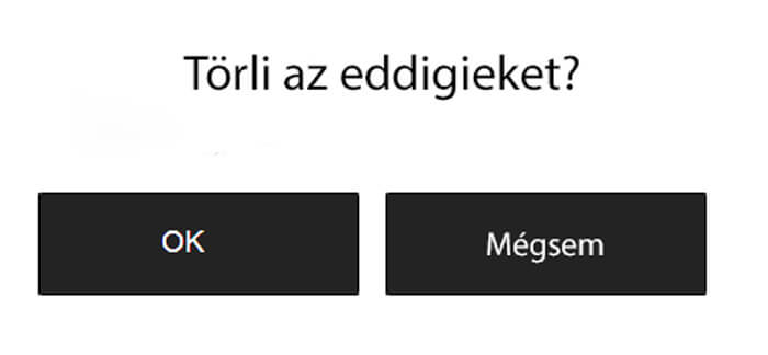
To illustrate with an example, the following question is asked above the button: "Do you delete the previous ones?"
We offer two options:
-
„OK”
-
„Cancel”
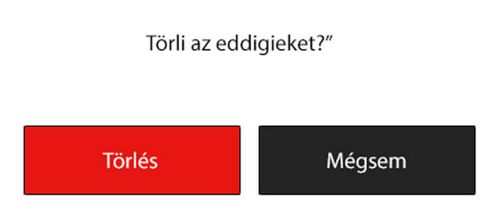
It may seem obvious at first, but it can be confusing for many users. Instead of using "OK", always use the clear answer to the question, in this example, "Delete".
4. Size the buttons appropriately
The size should reflect the importance of the button. The bigger a button is, the more important the task it performs, the more valuable the interaction with it is for both users and website owners.
Highlight buttons
The most important, in Hungarian, button with the highest conversion value should clearly show that it really is the most important. In all cases, highlight the call-to-action button (CTA). Increase its size, as a larger button seems more important, and use a striking, contrasting color compared to the rest of the page.
5. Use contrasting colors
Choosing the right color depends on a number of factors that can make getting users to take action more complicated. When designing the website, you must take into account the basic color itself, as well as the characteristics of your target audience. In the case of a website aimed at young people, you can safely use gaudy colors, however, in the case of a news site, the use of excessively gaudy colors may no longer be a good idea.
The use of contrasting colors increases the conversion rate of each button and the user experience (UX). In practice, you can achieve this by contrasting the background color of the buttons and the website so that the call-to-action (CTA) button is clearly visible.
For example, if the basic color of the website is light blue, it is advisable to use red or yellow for the buttons.
6. Order is important
The order and location of the buttons must match the communication between the user and the website. For example, the button with which we can move further or forward is logically on the right side of the page; and with which we can turn the page backwards, it should be located on the left side of the page.
7. Don't use too many buttons!
Using too many buttons is a common problem for websites. If you offer users too many options, they often end up not being able to make up their minds and not taking action on your page. Focus on the most important actions you want users to take on your website.
8. Use empty spaces as tools
White space is the space between page elements. Most people still do not consider its role when designing websites.
Blank space is not just the background of a web page, but a powerful tool for making it stand out. Every website is made up of many visual components, and white space helps users navigate between them by separating different elements from each other. Having the right amount of white space helps to attract users' attention by making the call-to-action button noticeable.
9. Test yourself!
If you want to know for sure that a button is working properly, test it! This golden rule is not only true for call-to-action (CTA) buttons, but also for other elements of the website.
Testing allows website owners to continuously improve the user experience (UX) of their website while also collecting data on the results. This allows them to form hypotheses and learn more about how certain elements influence user behavior within the website. Of course, this also means that it may turn out that a certain assumption was wrong and we have to change it so that our website works more efficiently.
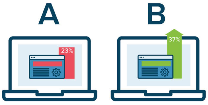
When you test a change, A/B testing helps you find out which changes affect user behavior on your website and which ones have no effect on your users.
10. Repetition
The human brain is an incredibly complex machine. Almost immediately, he notices recurring themes, words, and patterns in a text, which help him understand the entire content more quickly. Take advantage of this feature of the brain and use repetitive phrases on your website to prepare your visitors to take action.
Let's say you want more subscribers to your newsletter. For example, build the phrase "Save" into your page. Use it in your headline, content, and call-to-action. By the time the user gets to the option to sign up for the newsletter, their brain has already connected that clicking the "Subscribe to the newsletter" button will also save them money.
If you are not sure which repeating phrase you can use effectively on your website, use the primary keyword related to your page.
When the user searches for the given keyword in, for example, the Google search engine, he receives your website as a result. You see the word used in the search results list in the meta description, and then by clicking on it, you encounter it several times on your website. By the time you get to the call-to-action (CTA) button that includes your keyword, your brain has connected things and will be less hesitant to click the button you want.
12. Create a sense of urgency!
Everyone has encountered the situation in their life when salespeople (in any industry) work as if there is a constant emergency. Also, in many cases, a deadline is set for the acceptance of the agreement. The main reason for this is that certain words and patterns of behavior encourage us to make decisions and act more quickly.
That's why advertisements that last for a "limited time" or "while supplies last" are so common. Most people are more likely to buy now if they fear they won't be able to buy that product or service the next day.
This method emphasizes the uniqueness of your product or service and prompts users to perform the requested action as soon as possible before they miss the opportunity. This is the main reason why so many call-to-action (CTAs) contain the word “Now”.

Exclusivity is another very strong motivational factor. Everyone feels special when they have something that no one else has.
So don't simply ask your visitors to "Subscribe to my newsletter" but to "Be one of the first 1,000 users" or "Be the first to know". They will carry out what you ask of them to a greater extent if they feel that they are somehow different from the others.
13. Focus on the benefits
Remember what information you were looking for about the last product or service you purchased? The answer will certainly be that you were looking for why the given thing will be useful for you.
Many people make the mistake of emphasizing the features of their product or service rather than the benefits these features offer! A call to action (CTA) will be successful if we provide the answer to the users' most important question. And the question is: "Why is it useful for me?"
Users are not interested in product features, but in how these features help them solve their problems or how they can save time by using them.
A call-to-action button that says "Never be late again" is more effective than one that says "Check out our latest calendar app." The pairs "Save 10 hours a week" and "10 tips on how to save time" are also similar.
The call to action should always be aimed at the achievable result!
14. Reduce the risk!
All people like high value and low risk. Take advice from the best marketers and use the potential of emphasizing cashback. If you draw your users' attention to the fact that they are taking a minimal risk, you will help them make a decision and encourage them to purchase and register.
Make it clear to everyone that you offer a money-back guarantee in the event of a mistake. You have to make this clearly visible to them several times!
Furthermore, the power of the word "free" should not be underestimated. It might sound corny, but it's still one of the most powerful arguments you can use during your sales process.
So don't forget, the less risk your users have, the more likely they will take the action you want. Also, offer them something free (such as shipping) and they won't feel like they took any risk during the purchase.
15. Use of appropriate color
If you only sell your product or service online, you can only influence the visuality of your users. Therefore, it is essential to use the right color or color combinations.
Colors affect people's emotions and influence them subconsciously. For example, the color black has long been associated with sophistication, while pink is associated with femininity, and green means we can go. (Think about traffic lights)
Since you can only communicate with your users visually (and possibly even with sound), use a color that encourages them to click.
If you want to get them to make a decision related to physical activity, use yellow or orange colors. If trust has to play a big role in their decision, the best choice is blue. If you position your product high, purple will be the best choice, as people associate this color with luxury.
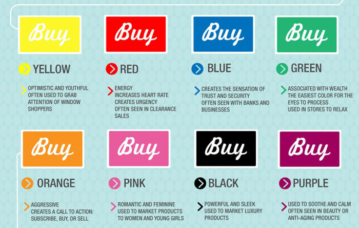
You can make your call to action (CTA) even clearer if you choose a color that is completely different from the rest of your website and that has a high contrast.
Be sure to avoid the situation where the color of your call-to-action (CTA) button is too simple. The base color of your website should never be gray, and your call-to-action button (CTA) should never be gray! The number of your conversions will be reduced to a minimum, since most people will simply skip over the gray color.
16. Time it right!
Previously, I wrote about how to ask your website visitors to click on call-to-action buttons (CTA). However, when you ask them is just as important!
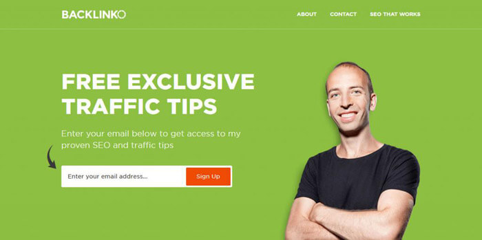
If you want to increase the number of subscribers to your newsletter, use a so-called "welcome mat". It is not as annoying as the pop-up window, and the user can easily navigate away from it (just scroll). In this way, the number of users leaving the page can be minimized.
If your goal is for your visitors to become customers, then the best solution is to follow the "Focus on the benefits" and "Reduce the risk" points mentioned in my article before asking them to buy!
17. Don't overcomplicate it!
It can be an effective solution if you follow up those who clicked on the call to action indirectly, with a secondary tool, for example with social media advertising deadlines, and try to get them to buy again. However, it can seem intrusive to many users if we constantly bombard them with our promotions after their purchase.
Also, it is not worthwhile if they come across several calls to action (CTAs) on your page at the same time. In such cases, it is more difficult for them to make a decision, because they have to choose. In all cases, the call to action should be clear and easy to understand. There should be as few elements on your page as possible that could distract your visitors from the desired action.
10 examples of effective call to action
MailChimp
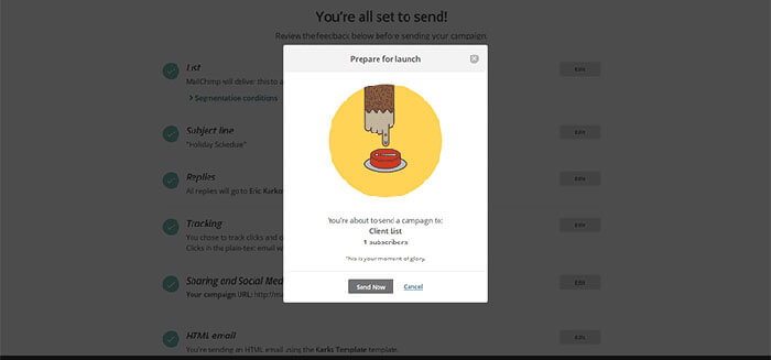
All of MailChimp's call-to-action buttons clearly indicate what the user should do. Even if it is not indicated in text, it will clearly show all users what happens after clicking on the button.
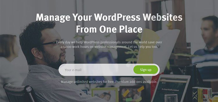
ManageWP
ManageWP actually treats your entire page as a call to action. The title and short descriptive text tell you exactly what services they have and simply ask you to enter your email address to proceed further.
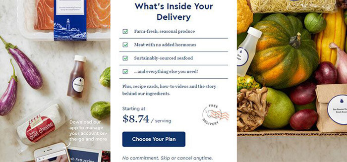
Blue Apron
This page arouses the interest of users with the help of "dry" facts. They direct their users to click through the ingredients of the food.
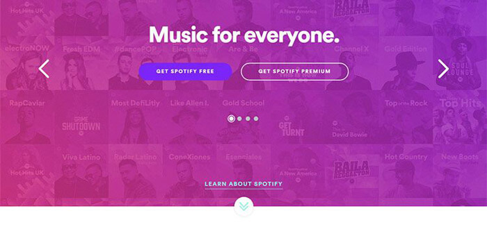
Spotify
Spotify encourages you to either click and sign up or learn more about their services. Without any unnecessary extra information.
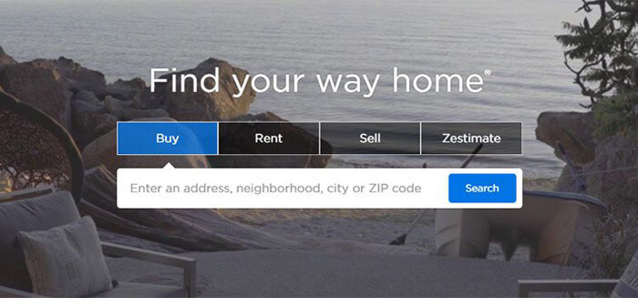
Zillow
B&O Play
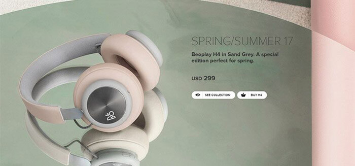
In the case of headphones, the most important thing, the sound, cannot be presented on a website. However, if we focus on industrial design and brand value, we can attract users' interest and encourage them to buy.
Mercy Corps
When an important situation needs to be improved, there is no time for side talk. The Mercy Corps website creates a sense of urgency with its website. A descriptive photo and clear headline ensure that visitors understand the importance of the situation.

Nest

Skagen
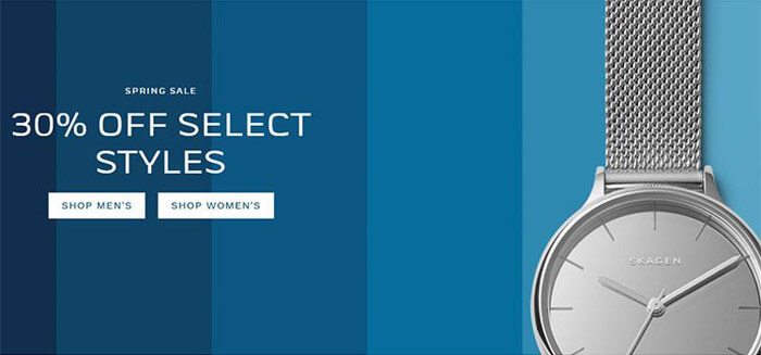
Skagen is a Danish company that sells minimalist watches. In line with this, the call to action is characterized by bold use of color and simplicity. In fact, the product itself is the call to action.
Patagonia
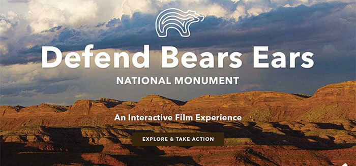
Patagonia offers products for hikers and hikers. The images on the website are large, bold and encourage us to explore nature. It offers exactly what the company's target audience likes!
Summary
With the help of the 7 points presented in this article, you can increase the user experience of your website and the number of conversions by helping them make their decision with basic and practically proven methods rooted in psychology.
If you apply the steps correctly, you can make the content of your website attractive to your visitors and sooner or later the visitors can become customers, and your customers can become your returning customers.


