More and more people know and like the so-called one pager design. However, many people still do not know it, have not yet discovered its potential. In my article, I present exactly what one pager design means, what advantages and disadvantages it has and how to get the most out of it.
What is the purpose of one pager websites?
The purpose of using one pager design is to provide visitors with the perfect amount of information (which can be processed with little reading) in making their decisions. There are no subpages on websites made with one pager design, the only page is the homepage itself. On such pages, the visitor can find all the information we want to communicate directly on the home page.

The advantage of one pager websites is that they allow excellent readability, fast navigation, elegant design and, of course, full mobile compatibility. In today's world, when users are bombarded with information on all channels, the simple structure of one-pager pages is a relief for all website visitors.
One pager design is an excellent option for many, but this does not mean that the use of one page websites offers a universal solution for everyone.
Tartalomjegyzék
Does one pager still have subpages?
In the previous sections, we explained what exactly the purpose of one-pager websites is, why they strive for minimal page usage. However, there are some cases when the use of subpages is accepted and allowed.
If you create subpages, always follow the following rules:
-
The subpage should be fully connected to the main page and should not contain any unnecessary information.
-
The links of the subpages should only be placed in the footer, so they do not distract the visitors from the content, but they should be easily accessible if they are needed.
In most European Union countries, it is mandatory to display the "imprint" on websites. Also, if we manage data on the website or offer products/services, the existence of the Data Protection and Purchase Information is a mandatory element!

When is it worth using one pager design?
Before embarking on a radical transformation of your website, be sure to consider; is this the best opportunity to achieve your goals? In the following, we will help you make a decision.
We recommend this style for you if you don't have too much content and the existing content is focused around one topic.
Some examples of when using a one pager design can be beneficial:
-
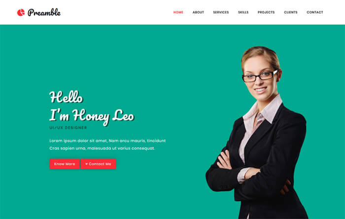
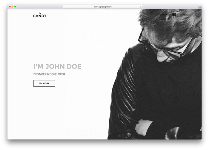
Personal website or online portfolio
-
Micro and small business websites that sell a few products or services
-
A page presenting a product
-
Landing page related to a promotion
-
Online CV
-
Event sites such as conferences and weddings.
When do we not recommend the one pager design?
If your website is complex, there is a lot of information and content on your page that is constantly expanding, then we definitely do not recommend a one-page web design. Don't choose a one pager...
- in the case of webshops with many products
- in the case of company websites with many menu items
- portal pages
- for projects that are particularly important from a seo point of view
5 tips for creating a beautiful and effective one pager website
1. Simplicity
Sometimes less is more, this saying is also often true for web design. The first step is to determine the main message you want to convey to users with your website. Then, make sure that the text is simple, short and to the point, i.e. easily digestible for all visitors.
Always think with the minds of your site visitors. When someone visits your website, they should immediately find the information that is important to them. In no case should you distract them with unnecessary things, such as a map with the route to us. All irrelevant information should be removed from the website.
More than half of internet surfers spend an average of less than 15 seconds on a web page. That's why, like them, you should spend 15 seconds on your website and ask yourself the following key questions:
-
Did I find the most important information easily?
-
Was the page's message clear to me?
-
Did the site make you curious and would you like to get more information?
2. Logical structure
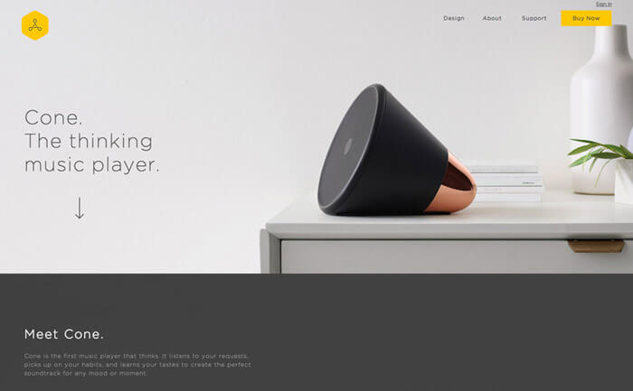
Designing for easy readability is essential. The content of the website should be divided into sections, so that visitors can more easily find the information they are interested in. A very effective way of doing this is the so-called "cone" structure. The most important information (for example, what the page is about) should be placed at the top of the website, and more and more specific and detailed information should be placed downwards.
The "cone" construction is illustrated through a concrete example
In the case of a website related to a wedding, the names of the newlyweds, the place and date of the wedding will be placed at the top of the website. Less important information, such as the seating order, is displayed at the bottom of the page.
Some useful elements for the logical structure of a one pager website:
-
For different sections, use a different background color
-
Create a unique header for each section
-
You can make individual sections even more interesting and beautiful by displaying the information in columns
-
Insert images between certain sections, breaking up the text
-
Feel free to use so-called "white space" on the website. You don't need to fill every single area with content!
-
Users should have every option to jump back to the top of the page. It is worth using a constantly appearing button to help jump to the top of the page
3. Visuality
Since most people are visual types - no matter how perfectly written the content of your website may be - if the page is not provided with appropriate visual content, visitors may quickly lose interest and leave your website.
Use images, videos, or graphics and slideshows to illustrate your content.
Images: Using a well-chosen high-resolution static image increases the chance that the first impression of visitors to our website will be positive, and therefore the number of conversions on our website will increase.
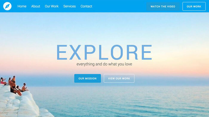
Videos: A picture is worth a thousand words, and a video is worth a million! Using video is the easiest and best way to capture the attention of our visitors.
Slideshow: Provides the opportunity to display several images at the same time in a relatively small area.
4. Simple navigation
Despite the fact that a website made with one page design can be easily scrolled, there is always a need for navigation on the page. In this case, the navigation serves to guide the visitors where to find the specific information, within the available one page.
In the case of one-pager websites, visitors are not navigated to different pages, but with the help of anchor links, we enable them to jump to the information they are looking for within one page.
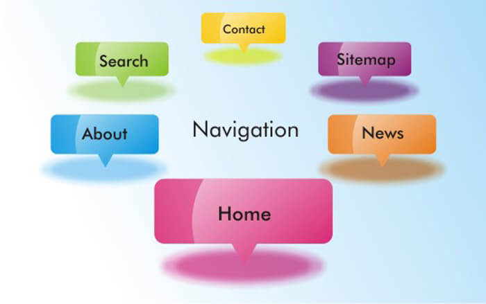
External links on the site may be confusing for visitors. If you do decide to steer visitors away from your page, the best solution is to make your intention clear, for example by using clear icons.
5. A clear call to action (CTA)
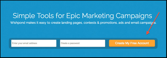
Call-to-action buttons (CTAs) and links are essential elements of any website. It is no different in the case of one-page design.
Have you ever signed up for a website newsletter? The answer is definitely yes, and if you think about it, you did it, among other reasons, because the given website clearly indicated what kind of action it expects from you. It is important that you also clearly express to your visitors what kind of action you expect from them.
One pager website samples
If you are looking for ideas and inspiration for your one-page concept, we recommend the websites in the list below, from which you can learn about the best pieces of one page design in our opinion; from individuals and businesses who used a one-page concept to create their websites.
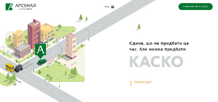
Kasko Arsenal
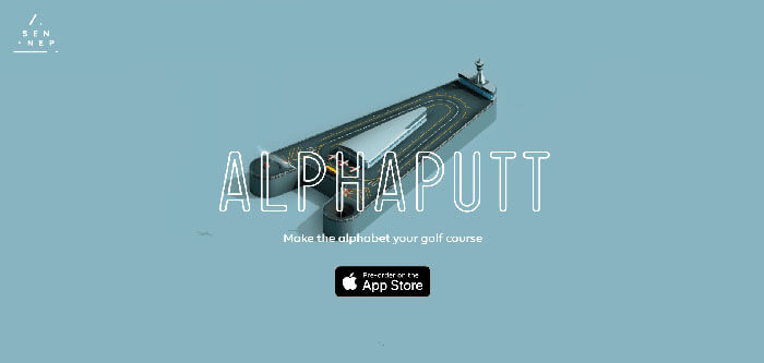
Sennep Games
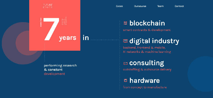
Future Comes Agency
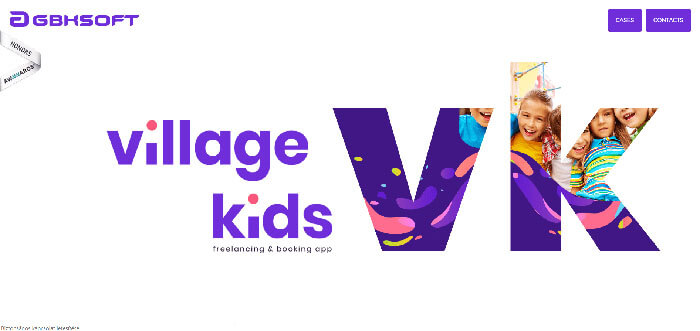
Village Kids
Milk / coppé
Titan Smartwatches
WBM Miami
Lo Pesce
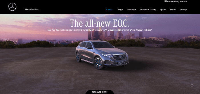
Mercedes Benz
Yuto Takahashi designer
Swatch
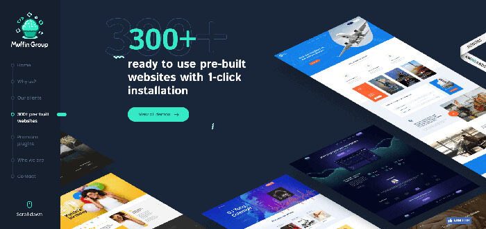
Muffin Group
Elias Ambühl
The Parfait Stand
Summary
Before you jump into designing your new one-pager design website, ask yourself the most important question: Is this the best way to achieve my goals with my website?
If the answer is a clear yes, then don't hesitate and go for it! Find a suitable web developer and start designing. The 5 points presented in the article provide an excellent basis for planning.

