As special as it sounds, one of the most important elements of any website is the footer. It may not be the most beautifully designed and impressive part of our website, but it is the place that visitors to our site visit first when they need information. That's why you should never forget about the footer when designing your website.
What elements should it contain? How do you fit in with the rest of the site while still being informative but not intrusive? We seek answers to these questions in our article.
Tartalomjegyzék
Designing the footer
The answer is that it all depends on the purpose of the website and the desired result. For example, if you are about to start a blog, then your goal is to keep visitors on your website, so for example it is smart to place links to your latest and most popular posts in the footer. However, if the primary purpose of your website is to promote a product or service, then you should place call-to-action (CTA) elements in the footer.
The design of the footer is not about how to display information that is not closely related to the page, but about how we can establish an order of importance between unnecessary and useful information.
The footer should be simple
A simple design is always important if you want to condense a lot of information into a relatively small space. And the footer is just such a place! When it comes to design, let's stick to simplicity, think carefully about what elements are needed for our visitors' uninterrupted browsing. Adjust the size of the footer to the amount of information so that it does not appear crowded
Using links in the footer
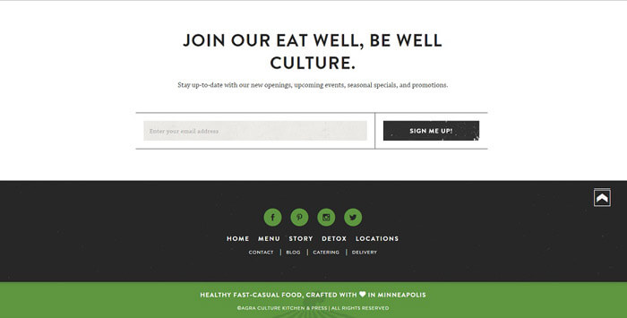
The two very important subpages of every website are "About" and "Contact". Visitors want to know who they are interacting with and who they are buying from. I would also like to know how to contact us in the event of a problem. Those interested should be able to reach these two subpages with one click.
Basic company information
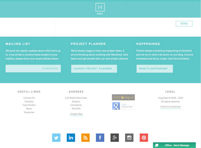
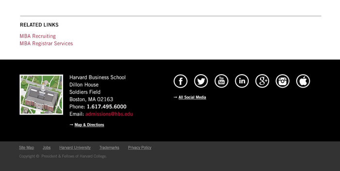
As mentioned above, a link should lead to the "Contact" subpage, but the basic company and contact information, such as the company name, address, phone number and email address, should definitely appear in the footer.
Group it!
We always organize related information and links into groups. This also promotes easy readability.
Call to Action (CTA)
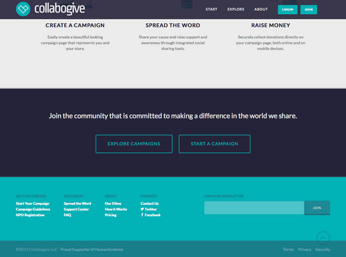
Since visitors visit the footer of the website many times, it is worth encouraging them to take action. Make it possible to subscribe to our newsletter and ask them to follow our social media page. Keep in mind that this area of the website converts very well.
Use images in the footer!
The footer on many websites only contains text information. Here should be our logo or, for example, the illustration related to our page and the social media icons. However, we must be very careful not to overcrowd it with images.
What should you use in the footer?
Here are some ideas and examples of how you can use the footer on your website to increase the effectiveness of your website.
Copyright
If we put only one element in the footer, it should definitely be this one. That is, the current year and the copyright symbol. By using this, we can reduce plagiarism on our site. As incredible as it sounds, experience has shown that it scares away most "thieves".
Sitemap
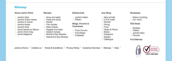
One of the most common links in the footer is the html-based map of the website. Visitors will rarely click on this, but similar to the "xml" map of a website, it can help search engines navigate the site.
Privacy Policy
This is one of the most important elements when designing a footer. Most of the time, it leads to a subpage that explains in detail what information the website collects, how it is stored and what it is used for.
Terms of Use
Many people confuse it with the data protection policy, even though the two are not the same at all. The terms of use describe what rules and conditions the visitor accepts by using the website. It defines, for example, the responsibilities that apply to the use of the given website.
Contact information
Visitors today expect contact information to be easy to find. It can be said that it is a web design standard that the footer must contain them.
This should be a contact form on a separate subpage and not an email address.
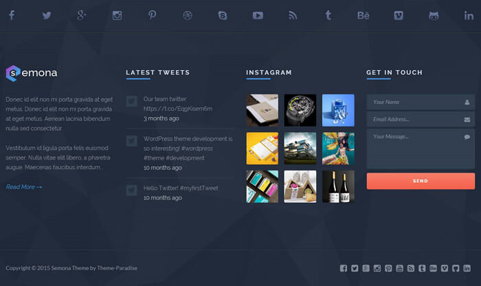
There are several practical reasons why you should use a form instead of an email address:
-
We can easily track the submission of the form - for example in Google Analytics - as a conversion goal
-
It is not certain that the visitor is browsing our site from the computer from which he writes emails
-
After submitting the form, we can direct users to a unique thank you page and encourage them to take action
-
After submitting the form, we can send an automatic email to the users with a call to action message
-
The person filling out the form is included in our database even if his message does not reach us for some reason
-
Published email addresses attract spammers
Address and map data
For a local business with a brick-and-mortar store, it's very important that visitors to your website can find it easily. Not to mention the possibility of making route planning available to us at the push of a button.
Phone number
In the past few years, browsing on a mobile device has become commonplace. Therefore, it is easy to imagine the situation that after we have aroused the interest of the visitor to our website, he wants to contact us immediately. If you find our phone number in the footer, you can do it with the click of a button!
Navigation
The trend of recent years shows that users prefer to use the footer of websites to navigate the site. More and more websites make their entire menu system available in the footer, as there are users who do not like the drop-down menu in the headers. They like to see what possibilities they have together.
Social media sites
It is important that we never use our header to redirect our visitors to social media. The footer is the best place for this! In addition, from a search engine optimization point of view, it is worth placing our Facebook or Instagram links in the footer, because it helps search engines connect our website and these interfaces.

Newsletter subscription option
Nowadays, it is no longer the most efficient way to collect subscribers, but regardless, it is worth leaving this option open for subscribing to our newsletters.
Login option
Visitors to our website can be more than just customers. They can also be employees, partners and resellers, for whom we provide a unique interface for internal use.
Since these people visit our site frequently, the login interface in the footer is the best for them, as they only need to scroll to the bottom of the page in any case.
Images and logo
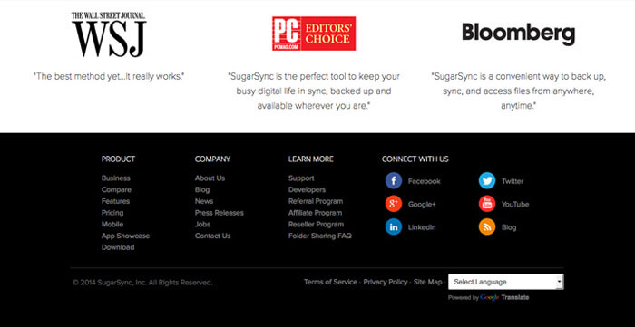
If you have a blog, a portrait of you makes you much more personal and authentic in the eyes of your visitors. In the case of a business, the company logo is essential in creating the image of the business.
A well-chosen picture says a lot about who we are and what values we follow. We can show off our team or use inviting images of something related to what we do. It is best to change this image from time to time, otherwise after a while the visitors will get so used to it that they will not even notice it.

Certificates and awards
One of the most effective ways to build trust is to display the awards we received and the certificates of qualifications related to our activities or their logos in the footer of our website.
Memberships
Another excellent tool for building trust is to include the logo of our chambers, associations and possible associations in our footer.
Summary
The footer says a lot about a website. Through this, you can show your visitors who you really are, what they can do and how they can behave on your website.
The footer is an important part of web design, so you should pay enough attention to its creation. Strive to create the best combination of information, usability and design.


